Timeline event
<ns-timeline-event> 
Overview
A partial component for the timeline, to show an event.
Examples
Guidance
Standard
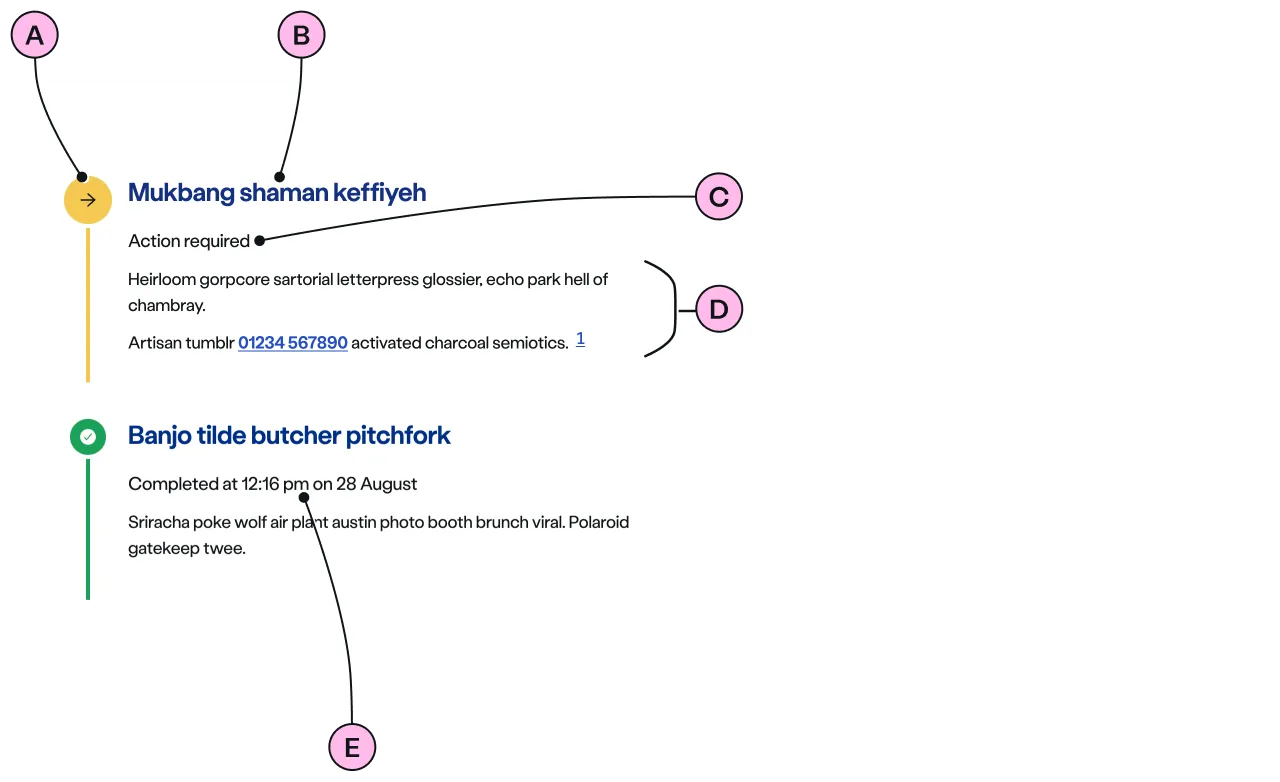
Key
| Key | Field type | Guidelines |
|---|---|---|
| A | Icon | The icon is dictated by the status. An optional icon can be included in the pending and cancelled status. See Icons. |
| B | Heading | The recommended length is between 4 and 12 words, not exceeding 50 characters in total. |
| C | Status | Status is also shown by colour and form of the interconnecting lines and circles in the timeline. E.g. In Progress is ‘information blue’ and has larger roundels and icons that are solid. Whereas Pending uses a grey outline and is smaller. Refer Status table below. |
| D | Additional content | Add further information relevant to this step to aid customer understanding, or if an action is required. |
| E | Completed status timestamp | Events that have been successfully completed, there is the option to display a time-stamp alongside the status. |
Event Status
Each event has a status. The status of the event is controlled by the decoration used.
| Decoration | Status | Description |
|---|---|---|
 | pending | Communicates that the event has yet to commence. |
 | inprogress | Indicates that progress is currently being made on this step. |
 | completed | The event has been successfully completed. |
 | actionrequired | This is used when a customer needs to take action in order to proceed with the process. |
 | warning | Informs of a problem with low severity such as foreseeable delays or outages etc. The problem is expected to be automatically resolved as the situation changes. |
 | error | This is a failure indication. Something couldn’t be resolved and so has halted the whole process marking other inprogress\ pending event(s) cancelled. It should be accompanied by a helpful message. |
| cancelled | Communicates that the event has been cancelled because of the error in any inprogress events. |
Icons & numerals
There are 3 styles of timeline to choose from in the ‘overview decorations’ - default, icon, or number.
Default
Uses a circle and implies nothing other than it is an event.
Icons
These can be selected from a list to help convey meaning for each event and make it easier to identify a step. If selected, all events will need an icon chosen from the list.
Numbers
For use when an order should be shown.
Some icons are special and automatically reserved for use only with a particular status, such as Complete tick, Action required arrow, Warning triangle, and Error diamond. These show on all the types of ‘overview decoration’.
Implementation
Placement
The ns-timeline-event component can only be used as a child of the <ns-timeline> element.
Specification
Attributes
aria-current
- Property
ariaCurrent- Type
string
status
- Property
status- Description
- The status of the event.
- Type
string- Options
pendinginprogressactionrequiredwarningerrorcompletedcancelled- Default
pending
icon
- Property
icon- Description
- The decorative icon to provide visual aid to the content of the event.
- Type
string- Options
- Refer to our icons.
- Default
index
- Property
index- Description
- The index to indicate logical order of the event in the timeline.
- Type
number- Default
0
updated-at
- Property
updatedAt- Description
- The optional date and time of the `completed ` event.
- Type
string- Default
role
- Property
role- Type
string- Default
listitem
type
- Property
type- Type
string- Default
standard
Slots
| Slot | Permitted tags | Description |
|---|---|---|
heading | The heading of the event and needs to be related to the content of the event. | |
| Anonymous slot | <ns-card> <p> | The content of the event. |
Specification notes
status
The status attribute should not be added when <ns-timeline-event> is placed in <ns-timeline> step type.
Figma
Please note: The ns-timeline-event Figma component configuration instructions
are available only to members of the British Gas workspace who have access to the
Nucleus Figma UI Kit.
Last updated: