Table
<ns-table> Overview
Table displays information in a grid-like format of rows and columns. It organizes information in a way that’s easy to scan, so that users can look for patterns and insights.
✨ This is an auto-generated AI summary of the ns-table's documentation. It may not be accurate. ✨
The table component consumes basic HTML table markup, which makes it accessible and responsive, as well as styling it.
Examples
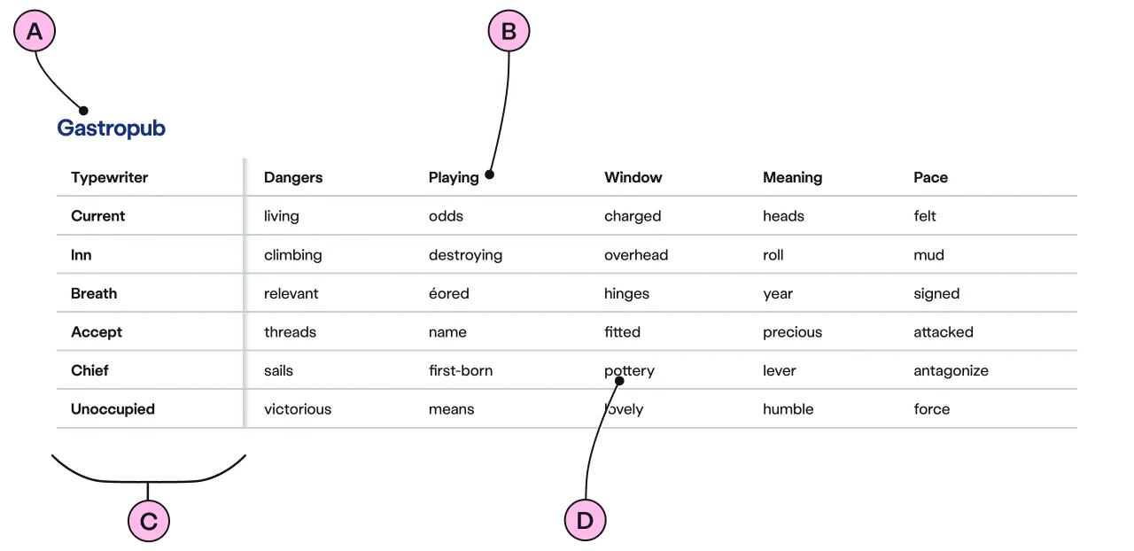
For when it is useful for the first column to maintain its position while scrolling horizontally through the remainder of the table.
Guidance
Standard

Key
| Key | Field type | Guidelines |
|---|---|---|
| A | Caption | Use to provide context to the table content. The recommended length is between 4 and 12 words, not exceeding 50 characters in total. |
| B | Column Headers | A short description of the data or information found in the column cells below. |
| C | Fixed Column | This column can be used for data or information. It can also be set to a fixed column of headers for each row. |
| D | Table Cells | This should contain the data or information required for each relevant column and row. |
Implementation
Placement
The ns-table component can be used in the following components:
Specification
Attributes
label-id
- Property
labelID- Description
- The identifier of the element outside the table element.
- Type
string
type
- Property
type- Type
string- Default
standard
Slots
| Slot | Permitted tags | Description |
|---|---|---|
| Anonymous slot | <table> | The anonymous slot for html table element. |
Figma
Please note: The ns-table Figma component configuration instructions
are available only to members of the British Gas workspace who have access to the
Nucleus Figma UI Kit.
(Opens in Figma).
Last updated: