Highlighter
<ns-highlighter> Deprecated 
Overview
Highlighter can be used to communicate error, info, success and warning messages.
✨ This is an auto-generated AI summary of the ns-highlighter's documentation. It may not be accurate. ✨
The ns-highlighter communicates messages that a service may not be available or that there are technical issues on specific pages. These differ from global messages as they only apply to some pages and are not site-wide. e.g. A message that says the top-up service may not be available would only apply to pages that customers will look at to top up.
Examples
Guidance
Standard
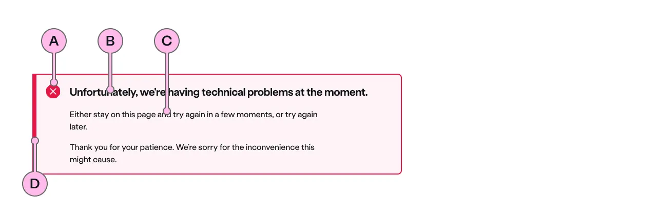
Key
| Key | Field type | Guidelines |
|---|---|---|
| A | Icon | The icon is dictated by the type. |
| B | Heading | The recommended length is between 4 and 12 words, not exceeding 50 characters in total. |
| C | Anonymous slot | A single, short paragraph works best. The text length should not exceed two paragraphs of 3 lines. Include emphasis with <strong>, inline links <a>, lists <ul> <ol>. Add a caveat link if required. |
| D | Accent | This is to support the context of the messaging. This colour matches that of the icon. |
Implementation
Placement
The ns-highlighter component can be used in the following components:
<ns-form><div>wrapped in<ns-panel>
Specification
Attributes
type
- Property
type- Description
- The type of the highlighter related to the contextual role.
- Type
string- Options
errorinfosuccesswarning- Default
error
Slots
| Slot | Permitted tags | Description |
|---|---|---|
heading | <h2> <h3> | The heading of the highlighter toned with its `type`. Heading level depends on its place in the semantics of the page. |
| Anonymous slot | <p> <div> | The anonymous slot for the highlighter message. |
Last updated: