Card
<ns-card> Overview
Cards can be used to contain content in a consistent and structured way.
Cards are to be used to apply a container around a related grouping of information. Achieve this through a combination of imagery, illustrations and typography.
Examples
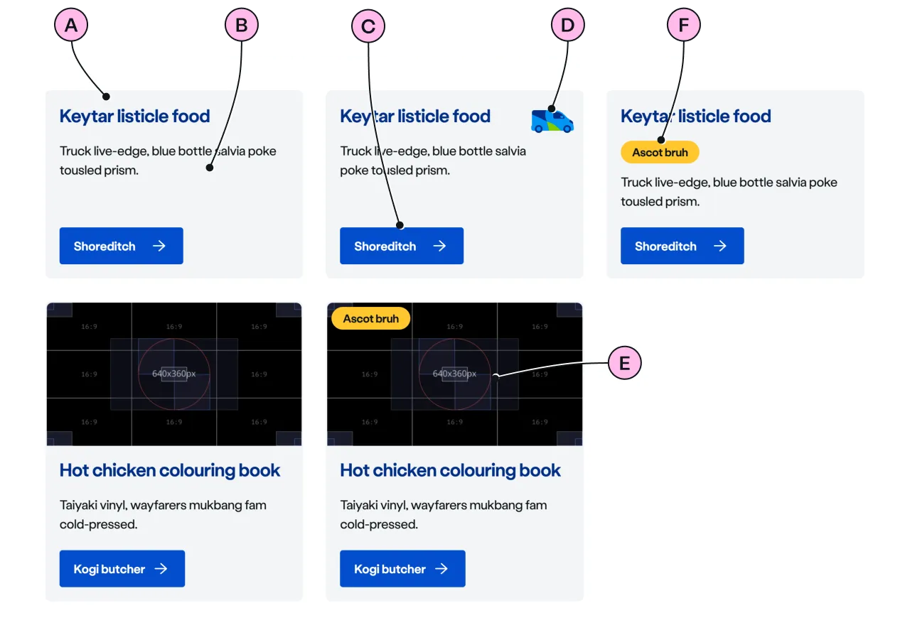
To group content within a visual container.
To add an illustrative icon to illustrate the content of the card.
To add an image to illustrate the content of the card.
To add a pill above the heading to highlight a status or characteristic of a card.
To add a pill that is over the image.
To indicate that the card contains content that is inactive.
To group content only using visual proximity, with no background.
To get a different responsive behaviour on basketball-court viewport.
Guidance
Standard

Key
| Key | Field type | Guidelines |
|---|---|---|
| A | Heading | The recommended length is between 4 and 12 words, not exceeding 50 characters in total. |
| B | Paragraph | A single, short paragraph works best. The text length should not exceed two paragraphs of 3 lines. Include emphasis with <strong>, inline links <a>, lists <ul> <ol>. Add a caveat link if required. |
| C | CTA | Keep the text short, relevant, and actionable. It should not exceed 24 characters. |
| D | Decoration | Use to support and highlight the content. See illustrations. |
| E | Image | Use an image size of 640 x 360px. Images should be WebP file type, the file size should be no more than 25kb. |
| F | Pill | Use a pill to highlight a small item of information to a customer. |
Support
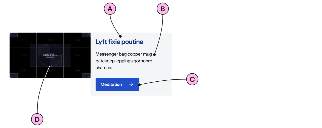
The support card has a responsive behaviour at basketball-court viewport, to enable a better layout for tablet-sized devices.

Key
| Key | Field type | Guidelines |
|---|---|---|
| A | Heading | The recommended length is between 4 and 12 words, not exceeding 50 characters in total. |
| B | Paragraph | A single, short paragraph works best. The text length should not exceed two paragraphs of 3 lines. Include emphasis with <strong>, inline links <a>, lists <ul> <ol>. Add a caveat link if required. |
| C | CTA | Keep the text short, relevant, and actionable. It should not exceed 24 characters. |
| D | Image | Use an image size of 640 x 360px. Images should be WebP file type, the file size should be no more than 25kb. |
Flat

Key
| Key | Field type | Guidelines |
|---|---|---|
| A | Heading | The recommended length is between 4 and 12 words, not exceeding 50 characters in total. |
| B | Paragraph | A single, short paragraph works best. The text length should not exceed two paragraphs of 3 lines. Include emphasis with <strong>, inline links <a>, lists <ul> <ol>. Add a caveat link if required. |
| C | CTA | Keep the text short, relevant, and actionable. It should not exceed 24 characters. |
Considerations
- Keep the type of CTA consistent across a group of cards.
- Always add heading to the group of cards inside the panel.
- Place the pill in the same location across the group of cards to improve the readability of the cards.
Implementation
Placement
The ns-card component can be used in the following components:
Specification
Attributes
decoration
- Property
decoration- Description
- The name of the illustration to display on the card.
- Type
string- Options
- Refer to our illustrations.
pill-over-image
- Property
isPillOverImage- Description
- The toggle to display the pill over the image of the card.
- Type
boolean- Default
false
inactive
- Property
inactive- Description
- To indicate that the card contains content that is inactive.
- Type
boolean- Default
false
inactive-message
- Property
inactiveMessage- Description
- The message to display when the card is inactive for screen readers.
- Type
string- Default
This item is inactive.
image
- Property
image- Description
- The URL of the image to display on the card. Image ratio should be `16 / 9`.
- Type
string
alt
- Property
alt- Description
- The alternate text of the image and needs to be related to the visual content in the image.
- Type
string- Default
background
- Property
background- Type
boolean
type
- Property
type- Description
- The type of the card.
- Type
string- Options
standardsupportflat- Default
standard
Slots
| Slot | Permitted tags | Description |
|---|---|---|
heading | <h2> <h3> | The heading of the card related to its content. Heading level depends on its place in the semantics of the page. |
paragraph | <p> | The content of the card. |
cta | <ns-cta> <a> | The call to action content for the card. |
action | <ns-cta> <a> <ns-form> | The action content of the card. |
Figma
Please note: The ns-card Figma component configuration instructions
are available only to members of the British Gas workspace who have access to the
Nucleus Figma UI Kit.
Accessibility
inactive
The inactive attribute indicates that the card’s content is inactive. The card will appear greyed-out to indicate this to a sighted user.
For a screen reader user the value of inactive-message provides context about why the content is inactive. This message will be read out by screen readers after announcing the heading. This inactive-message is hidden from sighted users.
<ns-pill>
Be careful adding <ns-pill> within the heading slot, as the content of the pill will be read out as part of the heading for screen readers.
In this example using Safari on a Mac with VoiceOver it will read out:
Heading level 3, 2 items - Special Offer Get energy with us. You are currently on a heading level 3.
<ns-card> <h3 slot="heading"> <ns-pill>Special Offer</ns-pill> Get energy with us </h3> ...</ns-card>Make sure that is what is expected. Remember the pill cannot be used on its own within a heading.
Our advice is to rarely include pills in headings, as they typically convey a message related to the heading but are not part of the heading content itself.
Last updated: