Expander
<ns-expander> 
Overview
A component to show and hide content related to heading.
✨ This is an auto-generated AI summary of the ns-expander's documentation. It may not be accurate. ✨
An expander consists of a heading and an anonymous content slot. Click on a heading to reveal the content. Click it again to hide the content.
Use an ns-expander component in an accordion, a product card, or other contexts.
Examples
A decorative icon can be used to convey meaning, signify certain information, assist the user in identification, or to attract their attention. See icon in the specification.
Guidance
Standard
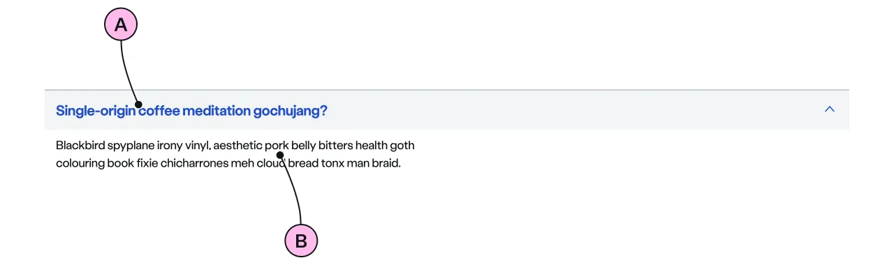
Key
| Key | Field type | Guidelines |
|---|---|---|
| A | Heading | Introduces the content in the anonymous slot. Clicking the headings reveals the content. The recommended length is between 4 and 12 words, not exceeding 50 characters in total. |
| B | Anonymous slot | Include headings, lists and paragraphs. Divide content into short paragraphs as it is easier to consume, and aids effective page scanning. Include emphasis with <strong>, inline links <a>, lists <ul> <ol>. Add a caveat link if required. |
Implementation
Placement
The ns-expander component can be used in the following components:
Specification
Attributes
colour
- Property
colour- Description
- The optional colour that can be applied to highlight the expander.
- Type
string- Options
''yellow- Default
icon
- Property
icon- Type
string- Options
- Refer to our icons.
- Default
open
- Property
open- Description
- The toggle to open the expander.
- Type
boolean- Default
false
type
- Property
type- Description
- The type of the expander.
- Type
standard- Default
standard
Slots
| Slot | Permitted tags | Description |
|---|---|---|
heading | <h3> <h4> | The heading of the expander and needs to be related to the content. Heading level depends on its place in the semantics of the page. |
| Anonymous slot | <p> | The anonymous slot for content. |
Events
| Name | Description |
|---|---|
expander-toggle | Dispatched when the expander is toggled. It holds the `open` state. |
Figma
Please note: The ns-expander Figma component configuration instructions
are available only to members of the British Gas workspace who have access to the
Nucleus Figma UI Kit.
(Opens in Figma).
Last updated: