Lockup
<ns-lockup> 
Overview
Lockups are a promotional component that signpost to a product or service, highlighting key messages.
✨ This is an auto-generated AI summary of the ns-lockup's documentation. It may not be accurate. ✨
Use ns-lockup to engage customers and promote products or services. The more relevant and contextual the content is for the intended customers, the better.
Examples
Highlight a key message, product or service with an image or video.
This type adds further variety to the component. Use the ‘with media group’ to tell a story with a group of images.
Guidance
Standard
Key
| Key | Field type | Guidelines |
|---|---|---|
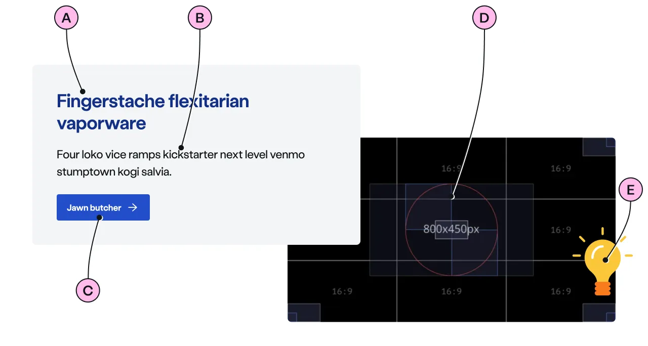
| A | Heading | The recommended length is between 4 and 12 words, not exceeding 50 characters in total. |
| B | Paragraph | A single, short paragraph works best. The text length should not exceed two paragraphs of 3 lines. Include emphasis with <strong>, inline links <a>, lists <ul> <ol>. Add a caveat link if required. |
| C | CTA | Keep the text short, relevant, and actionable. It should not exceed 24 characters. |
| D | Image | There is a choice of 3 image sizes: 800 x 450px, 800 x 600px, 800 x 800px. Images should be WebP file type, the file size should be no more than 50kb. |
| E | Decoration | Use to support and highlight the content. See illustrations. |
Flat
Key
| Key | Field type | Guidelines |
|---|---|---|
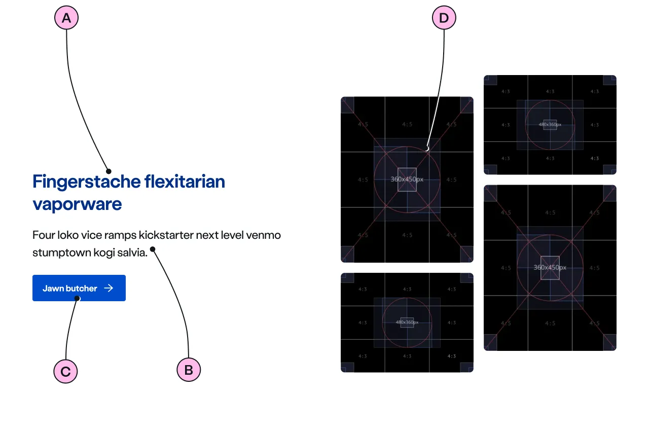
| A | Heading | The recommended length is between 4 and 12 words, not exceeding 50 characters in total. |
| B | Paragraph | A single, short paragraph works best. The text length should not exceed two paragraphs of 3 lines. Include emphasis with <strong>, inline links <a>, lists <ul> <ol>. Add a caveat link if required. |
| C | CTA | Keep the text short, relevant, and actionable. It should not exceed 24 characters. |
| D | Image | The <ns-media-group type="bento"> is supported which contains a group of images at a smaller size and in a variety of ratios. There is also a choice of 3 single image sizes: 800 x 450px, 800 x 600px, 800 x 800px. Images should be WebP file type, the file size should be no more than 50kb. |
Implementation
Placement
The ns-lockup component can only be used as a child of the <ns-panel> element.
Specification
Attributes
decoration
- Property
decoration- Description
- The decorative illustration to provide visual aid to the content.
- Type
string- Options
- Refer to our illustrations.
reverse
- Property
reverse- Description
- The toggle to reverse the order of content and image in the lockup.
- Type
boolean- Default
false
ratio
- Property
ratio- Type
string- Default
type
- Property
type- Description
- The type of the lockup.
- Type
string- Options
standardflat- Default
standard
Slots
| Slot | Permitted tags | Description |
|---|---|---|
heading | <h2> | The heading of the lockup and needs to be related to the content. |
paragraph | <p> | The content of the lockup. |
cta | <ns-cta> <a> | The interactive content for the lockup. |
image | <ns-image> <ns-video> <ns-media-group> | The media content and the visual in the media needs to be related to the content. |
Specification notes
Video
- Use
<ns-video>instead of<ns-image>when including a video instead of an image. The overlap is in front of the card so neither the video nor its captions are obscured. The content wraps around the video edge. (See the Video example above) - It is not possible to use an illustration decoration when including
<ns-video>.
Figma
Please note: The ns-lockup Figma component configuration instructions
are available only to members of the British Gas workspace who have access to the
Nucleus Figma UI Kit.
(Opens in Figma).
Last updated: