Selector
<ns-selector> 
Overview
Selector is a checkbox or radio form control that has additional information to describe it.
Showcase a product, service or option which users can select. The ns-selector component can function as a single or multiple selection for the user.
Examples
Use inform when the user should read the supporting content before committing to a choice.
Use type="lockup" when the selector needs stronger visual hierarchy and a more promotional, feature-led layout.
Guidance
Standard
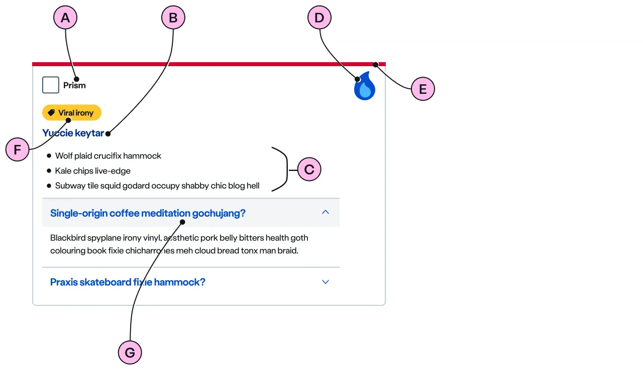
Key
| Key | Field type | Guidelines |
|---|---|---|
| A | Label | Describe the selection concisely. It should not exceed 24 characters. |
| B | Heading | A heading provides further description to the label. The recommended length is between 4 and 12 words, not exceeding 50 characters in total. |
| C | Paragraph | A single, short paragraph followed by an unordered list works best. The text length should not exceed one paragraph and a ticked list of 3 to 5 items. Include emphasis with <strong>, inline links <a>, lists <ul> <ol>. Add a caveat link if required. In an standard selector, this content should support the value of the label. |
| D | Decoration | Use to support and highlight the content. See illustrations. |
| E | Keyline | An optional colour keyline can be added to distinguish and draw attention to standard and inform selectors. keyline is not supported on type="lockup". |
| F | Pill | Use a pill to highlight something distinctive, such as a discount, promotion, or eco benefit. Place it above the heading and supporting content. Use it sparingly so it keeps its attention-grabbing impact. |
| G | Expanders | An optional <ns-expander> can be added within the selector to reveal more detail. It contains a heading and anonymous content slot. When the heading is clicked the content opens, and clicking the heading again hides it. |
Inform
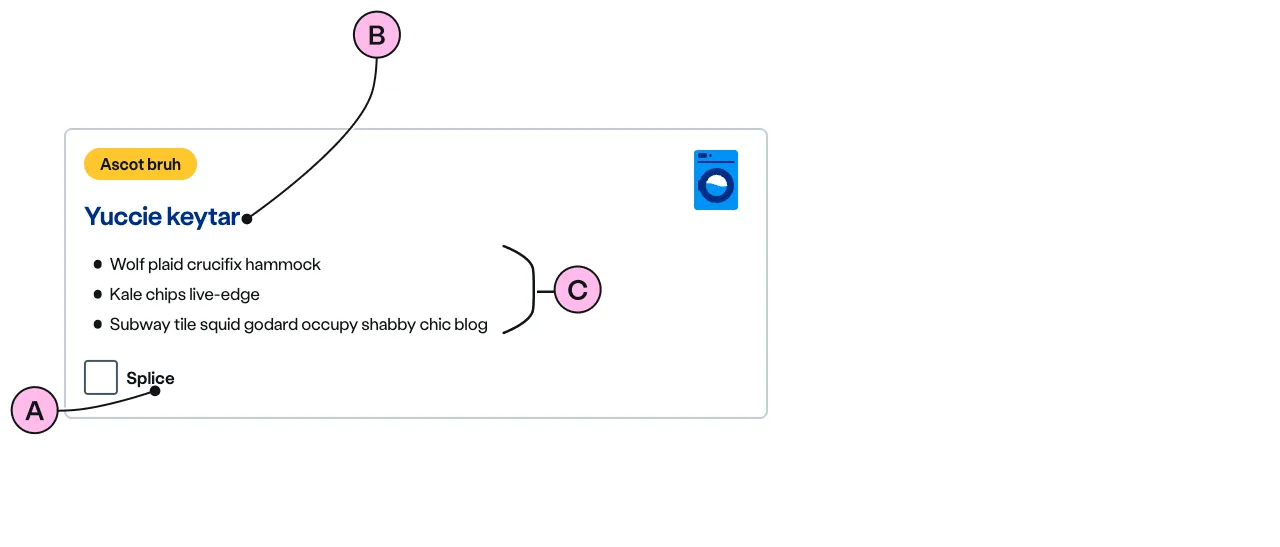
Use the inform attribute when the content is informing the user of the option, not supporting information. Placing the form control beneath the description encourages users to read the benefits, caveats, or explanatory copy before selecting.
Key
| Key | Field type | Guidelines |
|---|---|---|
| A | Label | Describe the selection concisely. It should not exceed 24 characters. |
| B | Heading | A heading provides further description to the label. The recommended length is between 4 and 12 words, not exceeding 50 characters in total. |
| C | Paragraph | A single, short paragraph followed by an unordered list works best. The text length should not exceed one paragraph and a ticked list of 3 to 5 items. Include emphasis with <strong>, inline links <a>, lists <ul> <ol>. Add a caveat link if required. In an inform selector, this content should explain the value of the label before the user selects it. |
Lockup
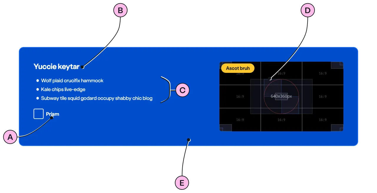
Use type="lockup" when the selector is used for marketing and offers. This layout works well when imagery and visual hierarchy are helping the user understand the offer.
Key
| Key | Field type | Guidelines |
|---|---|---|
| A | Label | Describe the selection concisely. It should not exceed 24 characters. |
| B | Heading | A heading provides further description to the label. The recommended length is between 4 and 12 words, not exceeding 50 characters in total. |
| C | Paragraph | A heading with a single, short paragraph followed by an unordered list works best. The text length should not exceed one paragraph and a ticked list of 3 to 5 items. Include emphasis with <strong>, inline links <a>, lists <ul> <ol>. Add a caveat link if required. |
| D | Image | Use an image size of 640 x 360px. Images should be WebP file type, the file size should be no more than 25kb. |
| E | Scheme | Use a scheme to distinguish and draw attention to lockup selectors. The scheme is applied to the whole selector |
Implementation
Placement
The ns-selector component can be used as a child of <ns-column> wrapped in <ns-inputter>.
Lockup placement
Pay close attention to the placement of type="lockup". The HTML markup must be:
<ns-panel> <ns-form> <ns-inputter> <ns-selector type="lockup"> <!-- content --> </ns-selector> </ns-inputter> </ns-form></ns-panel>Specification
Attributes
decoration
- Property
decoration- Description
- The decorative illustration to provide visual aid to the content of the selector option.
- Type
string- Options
- Refer to our illustrations.
image
- Property
image- Description
- The link to the image. The visual in the image needs to be related to the content of the selector option.
- Type
string
keyline
- Property
keyline- Description
- The keyline colour to distinguish and attract attention to the selector. Not supported when `type` is `lockup`.
- Type
string- Options
cyanlimenavyblueforestslateorangeredyellow- Default
inform
- Property
inform- Description
- The toggle to display the inform variation of the standard selector.
- Type
boolean- Default
false
pill-over-image
- Property
pillOverImage- Description
- The toggle to display the pill over the image of the selector.
- Type
boolean- Default
false
scheme
- Property
scheme- Description
- The colour scheme for the lockup type.
- Type
string- Options
whitecyan-lightlime-lightnavyblueyellowslate- Default
blue
type
- Property
type- Description
- The type of the selector.
- Type
string- Options
standardlockup- Default
standard
Slots
| Slot | Permitted tags | Description |
|---|---|---|
description | <div> | The description of the selector and needs to be short and clear. It is required when `decoration` is used and optional when `image` is used. |
pill | <ns-pill> | The pill to display on the selector. |
| Anonymous slot | <input> <label> | The anonymous slot for form elements such as input and label. |
Figma
Please note: The ns-selector Figma component configuration instructions
are available only to members of the British Gas workspace who have access to the
Nucleus Figma UI Kit.
Last updated: