Scroller
<ns-scroller> 
Overview
The scroller provides a container that horizontally scrolls the content which are too large to fit within the visible area of the window or containing element.
✨ This is an auto-generated AI summary of the ns-scroller's documentation. It may not be accurate. ✨
Examples
Use to display a list of items.
Use to display a list of ns-action-link items.
Use to display a list of ns-card items.
Use to display a list of ns-image items.
Guidance
Standard
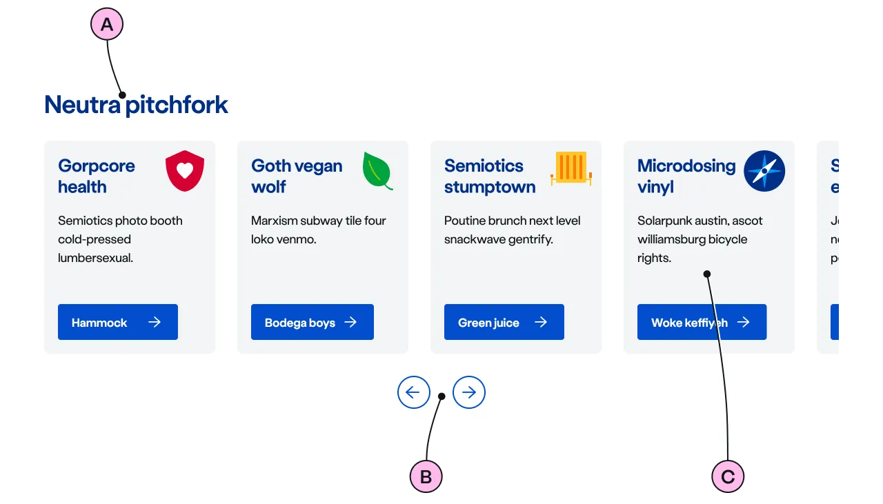
Key
| Key | Field type | Guidelines |
|---|---|---|
| A | Heading | Introduces an single instance or group of ns-scroller components. |
| B | Controls | Helps the user navigate the list of items incrementally in both directions |
| C | Content items | A list of same type components such as ns-cards, for the user to choose from. |
Implementation
Placement
The ns-scroller component can be used in the following components:
Specification
Attributes
hide-scrollbar
- Property
hideScrollbar- Description
- The toggle to display the scrollbar along the direction of the scroll.
- Type
boolean- Default
false
show-control
- Property
showControl- Description
- The option to show the navigation controls of the scroller in specific viewport breakpoint.
- Type
string- Options
alwaysmobiledesktopnone- Default
always
type
- Property
type- Type
string- Default
standard
Slots
| Slot | Permitted tags | Description |
|---|---|---|
heading | <h2> <h3> | The heading of the scroller that is related the content within the scroller. |
| Anonymous slot | <ns-card> <ns-image> <ns-action-link> | The list of homogenous contents. |
Events
| Name | Description |
|---|---|
scroll | Dispatched when the scrollbar is moved. |
move-scroller | Dispatched when the navigation control buttons are clicked. The event detail holds the direction of the movement. |
Figma
Please note: The ns-scroller Figma component configuration instructions
are available only to members of the British Gas workspace who have access to the
Nucleus Figma UI Kit.
(Opens in Figma).
Last updated: