Frame
<ns-frame> 
Overview
Frame provides a page navigation layout for specific contexts, like web apps (e.g. Customer account).
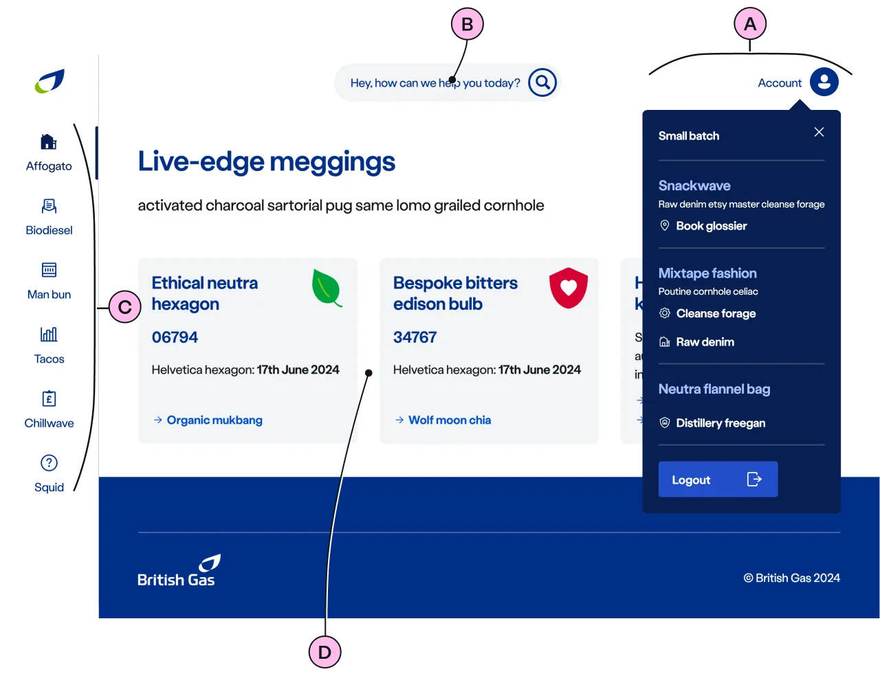
The ns-frame component comprises navigational buttons, customer account management menu and content area. Each of the button is mapped to different content for the specific context.
The account menu holds group of related links for customer account management.
It is useful in scenarios such as when a user is logged into their account.
Examples
Guidance
Standard
Key
| Key | Field type | Guidelines |
|---|---|---|
| A | Account menu | The list of links and needs to be grouped into sections with related labels. Refer to menu structure. |
| B | Search | When Search is shown, it will contain the value of the name attribute, allowing for personalisation. Refer to show-search. |
| C | Buttons | Each button includes an icon and a label and an associated url. When the number of buttons exceeds the visible space, it becomes scrollable. There is an option to hide the buttons. Refer to hide-buttons. |
| D | Anonymous slot | To contain <main> element with relavent content. Refer to Anonymous slot for the list of components that can be placed within <main> element. Pay attention to how the content displays at all resolutions. |
Implementation
Placement
The ns-frame component can only be used as a child of the <body> element.
Specification
Attributes
active-button
- Property
activeButton- Description
- The optional button index that needs to be selected by default.
- Type
number- Default
undefined
name
- Property
name- Description
- The account holder name that needs to be displayed.
- Type
string- Default
undefined
show-search
- Property
showSearch- Description
- The toggle to show search option in the header.
- Type
boolean- Default
false
hide-buttons
- Property
hideButtons- Description
- The toggle to hide the navigational buttons.
- Type
boolean- Default
false
hide-menu
- Property
hideMenu- Description
- The toggle to hide the menu in the header.
- Type
boolean- Default
false
app-view
- Property
appView- Description
- The toggle to indicate the usage of the component within the app.
- Type
boolean- Default
false
ignore-prefix-path
- Property
ignorePrefixPath- Description
- The path pattern to be ignored from the window location to match the button navigation link.
- Type
string- Default
buttons
- Property
buttons- Description
- The list of button objects. Each button has navigation link.
- Type
Array- Default
[]
menu
- Property
menu- Description
- The list of menu items that needs to be displayed in the navigation header.
- Type
Array- Default
[]
type
- Property
type- Type
string- Default
standard
Slots
| Slot | Permitted tags | Description |
|---|---|---|
| Anonymous slot | <main> | The anonymous slot for the content that needs to be displayed. |
Events
| Name | Description |
|---|---|
search-click | Dispatched when the search option is clicked. |
menu-click | Dispatched when the menu item is clicked. It holds the menu details. |
logout-click | Dispatched when the logout CTA is clicked from the account menu. |
button-click | Dispatched when the navigational button is clicked. It holds the button details. |
Specification notes
Buttons structure
[ { "icon" : "meter", "label" : "Meters", "url-pattern" : "/url/{regex-pattern}" }, ... { "icon" : "meter", "label" : "Meters", "url" : "/url/to/meter/page" } ...]Menu structure
[ { "label" : "Energy account", "data" : [ { "label" : "Address", "value" : "123 Kings Road, Townsville, AA12 3BB", "links" : [ { "label" : "Switch address", "url" : "/url/to/switch-address", "icon" : "location" }, ... ] }, ... ] }, ...]Anonymous slot
The <main> element should have,
Optionally the <main> element could have,
Figma
Please note: The ns-frame Figma component configuration instructions
are available only to members of the British Gas workspace who have access to the
Nucleus Figma UI Kit.
Last updated: