Password
<ns-password> 
Overview
Supports users when entering an existing or creating a password.
✨ This is an auto-generated AI summary of the ns-password's documentation. It may not be accurate. ✨
The ns-password component includes a set of features that help users not only enter a password but also accommodate their need to create one.
This component wraps the ns-inputter. Consider the guidelines defined for the ns-inputter when using this component. See <ns-inputter> documentation.
Examples
Use the standard type to enter an existing password.
Use the confirm type for creating and checking a new password.
Guidance
Standard
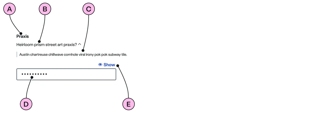
Key
| Key | Field type | Guidelines |
|---|---|---|
| A | Label | Clearly define the purpose. ‘Password’ is the preferred choice. |
| B | Helper | Optional helpful messaging can be used. |
| C | Tip | Optional explanatory information. |
| D | Input | By default the input is masked. |
| E | Show/Hide | Toggle to reveal or hide the password. |
Confirm
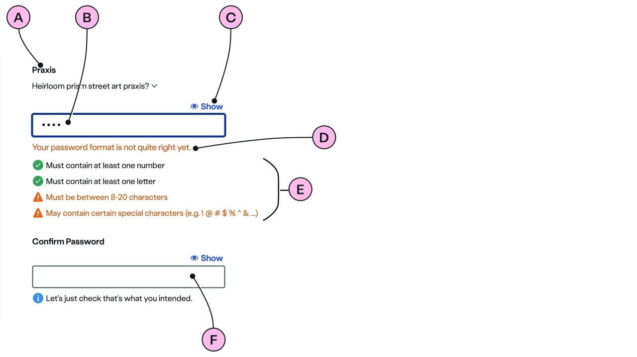
Key
| Key | Field type | Guidelines |
|---|---|---|
| A | Label | Clearly define the purpose. ‘Password’ is the preferred choice. |
| B | Input | By default the input is masked. |
| C | Show/Hide | The show/hide toggles are dependent on each other to make comparison easy. |
| D | Validation message | Dynamic messaging to help the user correctly format when creating their new password. |
| E | In-line validation | Instantly updates as the user creates their password. |
| F | Confirmation | Checks the user has entered the password they intended by matching them. |
Implementation
Placement
The ns-password component can be used in the following components:
<form>wrapped in<ns-form><ns-form-group>
Specification
Attributes
helper
- Property
helper- Description
- The helper text of the password.
- Type
string- Default
label
- Property
label- Description
- The label of the password used in `default` and `confirm` types.
- Type
string- Default
Password
confirm-label
- Property
confirmLabel- Description
- The label of the confirm password used in `confirm` type.
- Type
string- Default
Confirm Password
name
- Property
name- Description
- The name of the password to reference in form data.
- Type
string
value
- Property
value- Description
- The value of the password.
- Type
string- Default
labelID
- Property
labelID- Type
string- Default
heading
- Property
heading- Type
string- Default
type
- Property
type- Description
- The type of the password to use.
- Type
string- Options
defaultconfirm- Default
standard
Slots
| Slot | Permitted tags | Description |
|---|---|---|
tip-details | <p> | The tip details related to the `helper` text of the password. |
Events
| Name | Description |
|---|---|
change | Dispatched when the value changes. It holds the value of the password. |
Figma
Please note: The ns-password Figma component configuration instructions
are available only to members of the British Gas workspace who have access to the
Nucleus Figma UI Kit.
(Opens in Figma).
Last updated: