Product card
<ns-product-card> Overview
The product card enables users to browse, compare and choose a product.
✨ This is an auto-generated AI summary of the ns-product-card's documentation. It may not be accurate. ✨
Examples
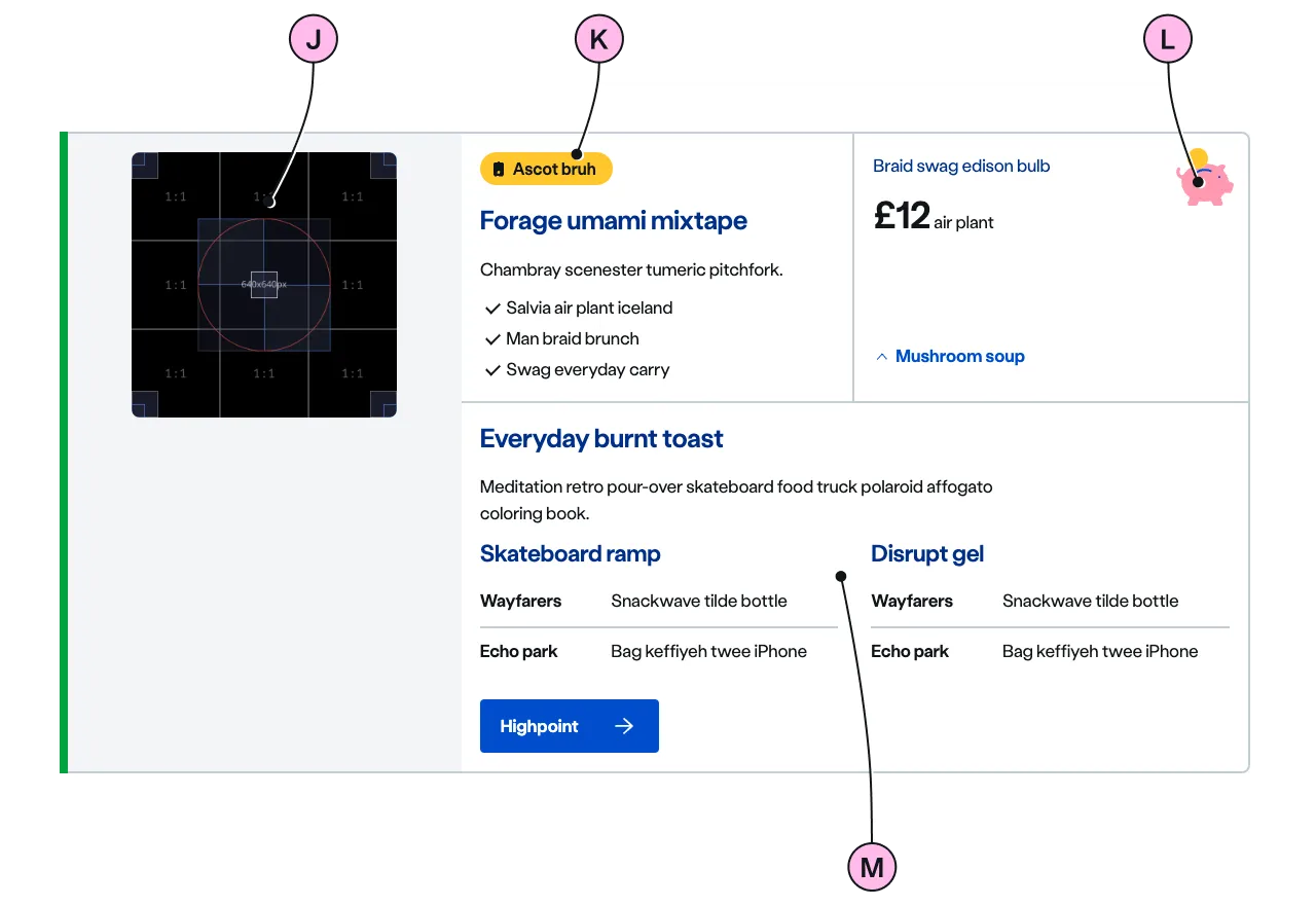
A horizontal layout in wider content ares, including additional features.
Guidance
Standard

Key
| Key | Field type | Guidelines |
|---|---|---|
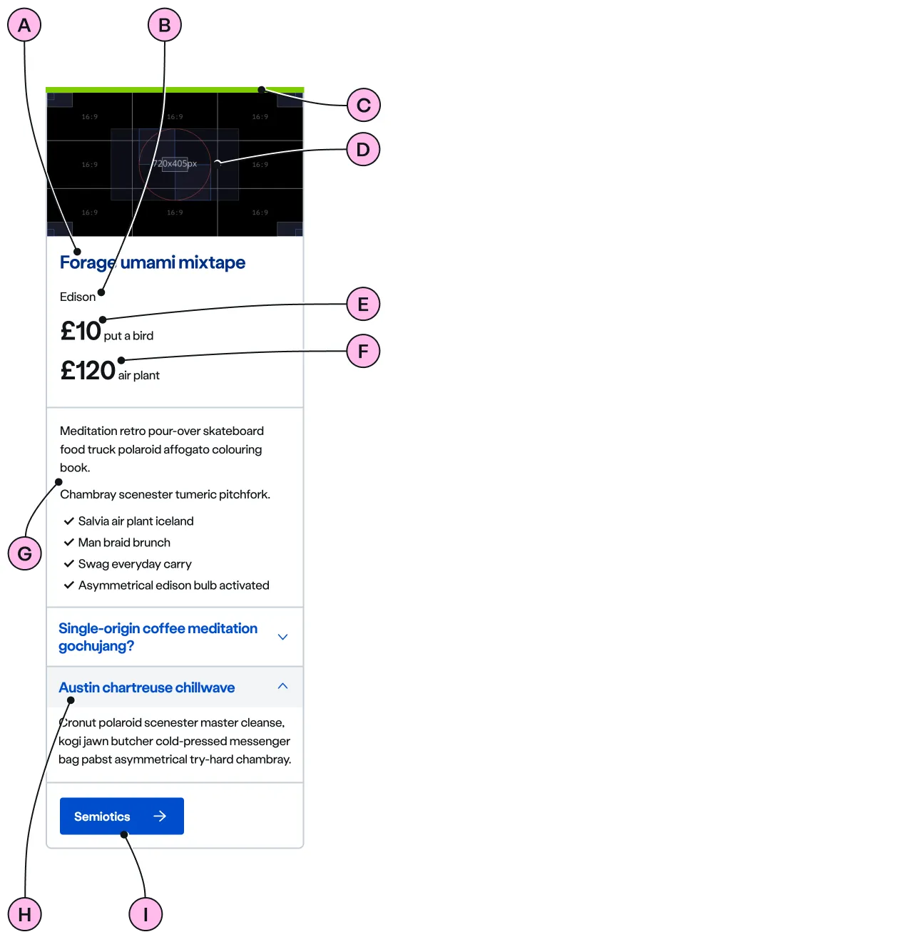
| A | Product name | The product name should be brief and memorable, ideally 2 to 3 words (10 to 15 characters). Maximum 25 characters. |
| B | Price subtitle | This should be used to give context to your product price. 15 to 23 characters maximum. |
| C | Keyline | An optional colour keyline can be added to distinguish and draw attention to your products. |
| D | Image | There is a choice of 2 image sizes for Standard: 720 x 405px and 720 x 540px. Images should be WebP file type, the file size should be no more than 50kb. |
| E | Primary price | The is the leading product price. This is optional as a product price may not always be available. |
| F | Secondary price | This is the secondary product price. This is also optional. |
| G | Product description | The product description can accommodate multiple sub headings, lists and paragraphs. The content should be concise and use bulleted or checked lists to support skim reading. Comparable product features should be repeated in the same list order across all products. Content can contain bold copy <b> <strong>, inline links <a>, lists <ul> <ol>, and caveats if required <a href="#caveat">Caveat</a>. |
| H | Expander | Expanders can be used to provide additional product detail. Each product should have a maximum of 3 expanders. |
| I | CTA | Keep the text short, relevant, and actionable. It should not exceed 24 characters. |
Horizontal

| Key | Field type | Guidelines |
|---|---|---|
| J | Image | There is a choice of 3 image sizes for Horizontal: 640 x 360px, 640 x 480px and 640 x 640px. Images should be WebP file type, the file size should be no more than 25kb. |
| K | Pill | Use ns-pill to promote an option that has something special like a discount, a promotion or a because it’s eco-friendly. |
| L | Decoration | Use to support and highlight the product. See illustrations. |
| M | Details | Details can be opened displaying additional information. It’s specifically designed to increase click-through and expose additional information without overwhelming the initial view. If no slot="details" is present, the CTA will assume this position. |
Implementation
Placement
The ns-product-card component can only be used as a child of the <ns-column> element.
Specification
Attributes
decoration
- Property
decoration- Description
- The name of the illustration to display for horizontal type.
- Type
string- Options
- Refer to our illustrations.
show-more
- Property
showMore- Description
- The object to customise the default values for show more label and show less label and to set the open state of the details for horizontal type.
- Type
object
keyline
- Property
keyline- Description
- The keyline colour to distinguish and attract attention to the product.
- Type
string- Options
cyanlimenavyblueforestslateorangeredyellow- Default
type
- Property
type- Description
- The type of product card.
- Type
string- Options
standardhorizontal- Default
standard
Slots
| Slot | Permitted tags | Description |
|---|---|---|
image | <ns-image> | The image that needs to be related to the product. |
name | <h2> <h3> | The name of the product. Heading level depends on its place in the semantics of the page. |
price-heading | <h3> <h4> | The price heading of the product and the heading level needs to one level lower than the heading level of the product. |
price | <div > ns-price> | The price of the product. |
description | <div > p> <div > ul> <div > ol> | The description of the product and needs to be short and clear. |
expander | <ns-expander> | The expander to provide additional product detail for standard type. |
details | <div> | The details of the product, hidden by default until 'More details' is pressed for horizontal type. |
cta | <ns-cta> | The interactive content to link to the product page. |
Events
| Name | Description |
|---|---|
product-details-toggle | Dispatched when the show more details is toggled in horizontal type. It holds the open state of the toggle. |
Specification notes
show-more
The show-more attribute is an object that consists of open-label, close-label and open properties.
| Property | Description |
|---|---|
open-label | The label for CTA when details is in closed state. |
close-label | The label for CTA when details is in opened state. |
open | When true, the details is expanded by default. |
const show-more = { 'open-label': 'Show more', 'close-label': 'Show less', open: true}Figma
Please note: The ns-product-card Figma component configuration instructions
are available only to members of the British Gas workspace who have access to the
Nucleus Figma UI Kit.
(Opens in Figma).
Last updated: