Action link
<ns-action-link> Overview
Action links are decorative links used to navigate to another page or perform an action.
✨ This is an auto-generated AI summary of the ns-action-link's documentation. It may not be accurate. ✨
Examples
The decoration is positioned to the right of the label at smaller viewports.
The decoration is always positioned above the label.
Guidance
Standard

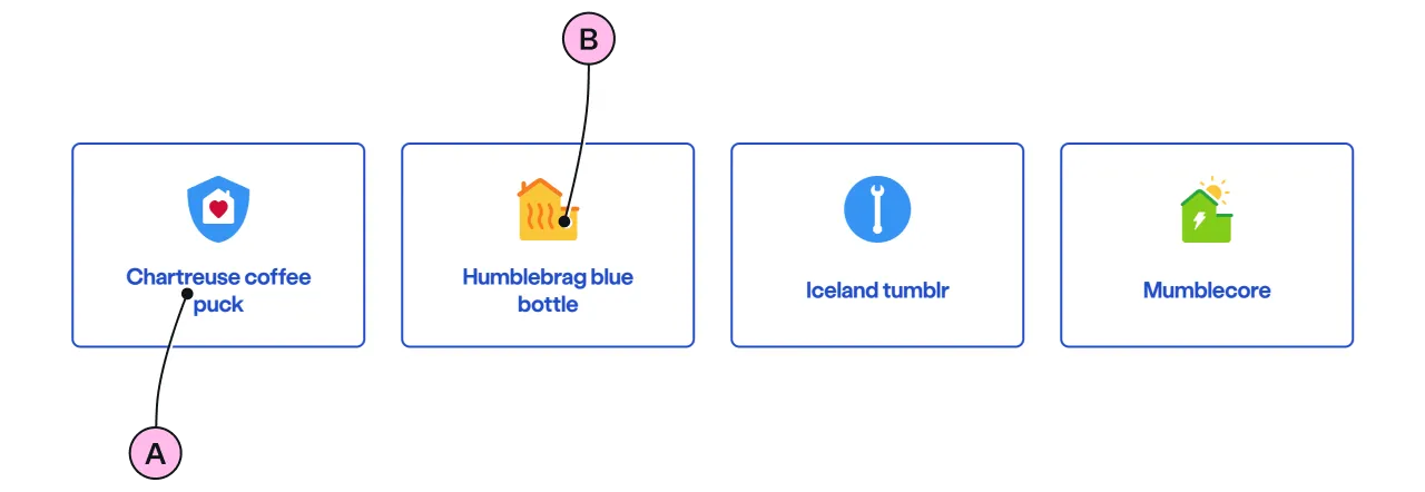
Key
| Key | Field type | Guidelines |
|---|---|---|
| A | Label | Keep the text short, relevant, and actionable. It should not exceed 24 characters. |
| B | Decoration | Use to support and highlight the label. See illustrations. |
Implementation
Placement
The ns-action-link component can only be used as a child of the <ns-column> element.
Specification
Attributes
label
- Property
label- Description
- The text to display and needs to be related to the link.
- Type
string- Default
decoration
- Property
decoration- Description
- The decorative illustration to provide visual aid to the link.
- Type
string- Options
- Refer to our illustrations.
- Default
href
- Property
href- Description
- The link to another page or section in the same page.
- Type
string- Default
type
- Property
type- Description
- The type of action link.
- Type
string- Options
standardstacked- Default
standard
Specification notes
Within link
<ns-action-link> can be wrapped within an <a> tag. If so, href attribute in <ns-action-link> can be omitted.
<a href="#!"> <ns-action-link label="Boilers from £185" decoration="boiler"></ns-action-link></a>Figma
Please note: The ns-action-link Figma component configuration instructions
are available only to members of the British Gas workspace who have access to the
Nucleus Figma UI Kit.
(Opens in Figma).
Last updated: