Control
<ns-control> 
Overview
A control button allows users to manipulate the UI or perform an action.
✨ This is an auto-generated AI summary of the ns-control's documentation. It may not be accurate. ✨
ns-control allows users to take actions or make choices with a single interaction. These buttons can have text visible or hidden if the icon is enough to convey meaning.
Examples
Guidance
Standard
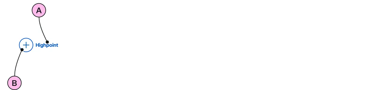
Key
| Key | Field type | Guidelines |
|---|---|---|
| A | Label | Keep the text short, relevant, and actionable. It should not exceed 24 characters. |
| B | Icon | Use to support and highlight the type of control. |
Implementation
Specification
Attributes
aria-hidden
- Property
ariaHidden- Type
string
tabindex
- Property
tabIndex- Type
number
icon
- Property
icon- Description
- The icon to display in the control button. Defaults to 'plus'.
- Type
string- Options
chevronchevron-leftchevron-rightchevron-upchevron-downplusminuscrosssearch- Options
- Refer to our icons.
- Default
plus
text-position
- Property
textPosition- Description
- The position of the text relative to the control.
- Type
string- Options
startend- Default
end
hide-text
- Property
hideText- Description
- The toggle to hide the text content.
- Type
boolean- Default
false
type
- Property
type- Type
string- Default
standard
Slots
| Slot | Permitted tags | Description |
|---|---|---|
| Anonymous slot | The anonymous slot for text content; this must be present even if `hide-text` is set to true (required). as users of assistive technology still need context. |
Events
| Name | Description |
|---|---|
click | Dispatched when the control button is clicked. |
Figma
Please note: The ns-control Figma component configuration instructions
are available only to members of the British Gas workspace who have access to the
Nucleus Figma UI Kit.
(Opens in Figma).
Last updated: